
Image courtesy of Lauren Nickels, graphic by Sophia Salganicoff
From Classroom to CTA: Lauren Nickels on Designing for Connection
As a student and graphic design intern for the Chicago Transit Authority (CTA), Lauren Nickels rides between campus and the agency’s offices, balancing studio work with internal design projects for the transit system she relies on. “I love public transit. I’m an avid supporter of public transportation, and it’s such a big part of life in Chicago,” said Nickels, who is in her final semester in the School of the Art Institute of Chicago’s (SAIC) Visual Communication Design department.
Nickels brings her playful yet research-driven design sensibility to the inner workings of Chicago’s expansive transit network. Working within the HR Engagement, Marketing & Outreach team, her work focuses on internal design projects that foster connection among the people who keep the city running.
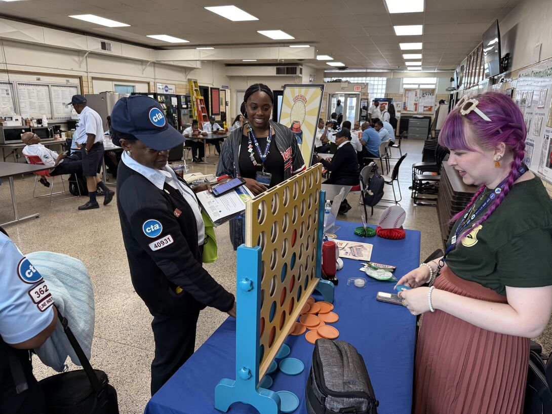
Photo courtesy of Chicago Transit Authority, all copyrights retained by CTA.
“A lot of design work, especially branding, is very outward facing,” she said. “It’s been interesting to work on almost entirely internal projects that people outside of the CTA don’t see. I didn’t even think about how much design goes into the small things that create community.” At the CTA, she has learned how design functions in a civic ecosystem. “Some of the work I’ve done has been for employee events,” she said. “I’ve gone to those events and met train operators and bus operators, the people who keep the CTA running. It’s been interesting to talk to so many people behind the scenes.”
Her assignments range from digital graphics to physical event materials. One of those events featured a custom game she designed. Her experience in SAIC course Heavy Cardboard: Designing Boardgames helped steer the project. She designed a CTA-focused version of Pin the Tail on the Donkey: Pin the Token in the Fare Box. “I’ve gotten really into board game design,” she said. “It’s something that involves a lot of problem-solving and iteration.”
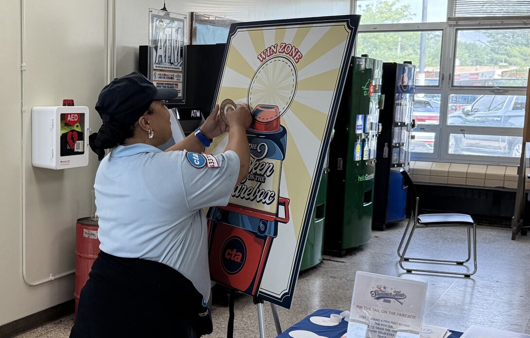
Photo courtesy of Chicago Transit Authority, all copyrights retained by CTA.
Her role has also given her insight into how large institutions handle visual systems. “I was surprised by how much creative freedom I actually have,” she said. “Because it’s internal, I’ve been able to experiment and make things playful while still keeping them within the brand.”
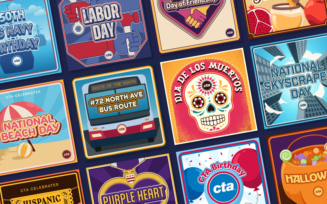
Graphics courtesy of Lauren Nickels and Chicago Transit Authority, all copyrights retained by CTA
Nickels’s time at SAIC has given her the tools to adapt her creative practice to any context. “I’ve mainly focused on branding and package design,” she said, “but in a lot of my work I experiment with different mediums and programs when I’m working.”
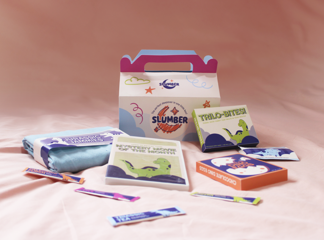
As a student, her process is marked by curiosity and boldness. In her Slumber packaging project for her Package Design studio class, bright type, dinosaur characters, and pastel gradients transform a children’s sleepover subscription kit into a joyful tactile experience.“With package design and creating something three dimensional, I enjoy working with a piece that has multiple aspects to it.”
Design by Lauren Nickels, image courtesy of Lauren Nickels.
Her Field Museum rebrand, completed for her Identity Systems class, uses playful typographic forms to represent the museum’s collection through categories like evolution, fungi, and artifacts, offering a glimpse of how she merges structure and storytelling. “My favorite projects have come from a place of research,” she said. Her education prepared her for the kind of flexibility required at her CTA internship.
“The main thing that’s come into play is my knowledge of the programs,” she said. “In my job I mainly work in Adobe Illustrator. In school, projects usually have long timelines because classes meet once a week, but in an office you’re there every day. Having that experience with the programs makes it easier to get work done.” She added, “Sometimes someone will ask for data organized into a chart or a simple motion graphic, and I’ll think, ‘Oh, right, I did learn that.’”
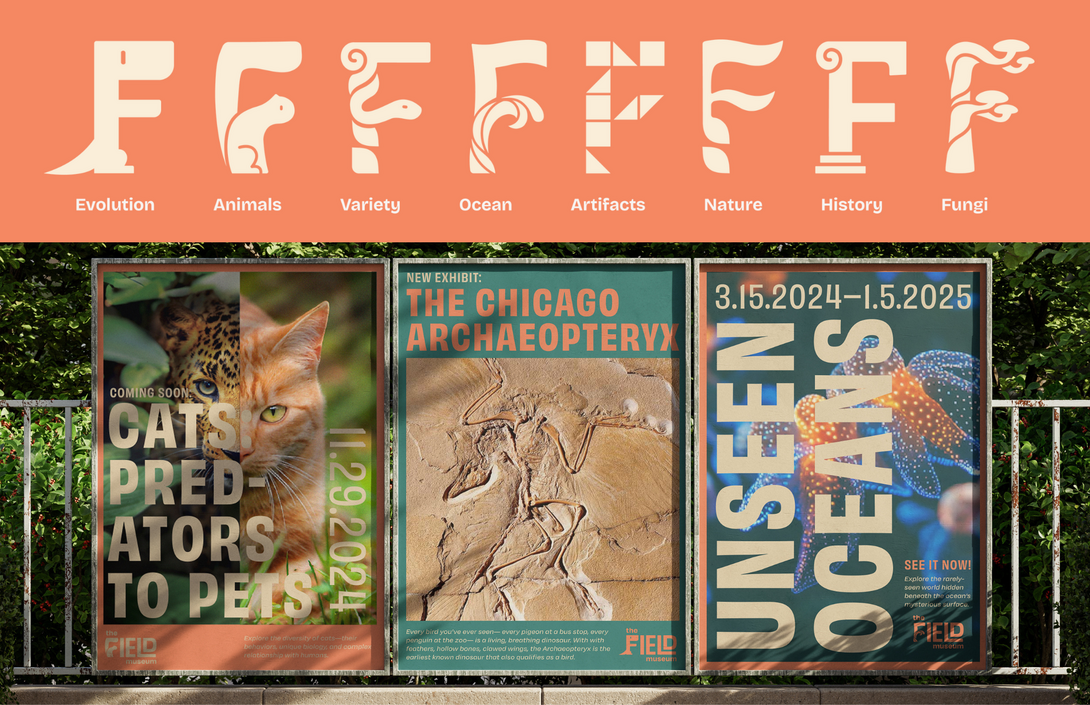
Image and designs courtesy of Lauren Nickels
As she prepares to graduate, Nickels plans to continue part-time with the CTA through spring while seeking new opportunities. “My current team has such a nice company culture,” she said. “Everyone’s excited to be there.”
Her advice to other students reflects her own openness to growth. “Don’t overlook any opportunities,” she said. “When I was applying, I was mostly looking for branding and packaging positions, but I thought, ‘I’ll apply to any graphic design job I can find.’ I wasn’t really sure what I’d be doing, but it’s been a rewarding and fun job.”
Photo courtesy of CTA, Lauren Nickels, all copyrights retained by their respective owners.
Nickels’s time at SAIC taught her to think through process and adapt through experimentation. At the CTA, those same skills turned into practical tools for collaboration, research, and creative problem solving. Her experience shows how a design education built on research and adaptability translates into real-world skills that travel far beyond the classroom. From packaging prototypes to public transit graphics, her work demonstrates that good design, in any form, keeps things and people moving and connected to one another.
This fall, SAIC Galleries will present two interlinked exhibitions.
